
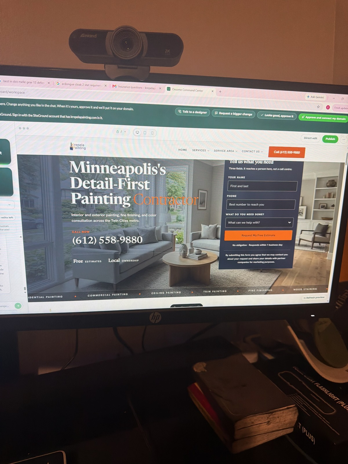
Family-owned · Minneapolis Local Minneapolis (612) 558-9880
Krepela Painting
Paint Color Consultation That Gets It Right

Family-owned · Minneapolis Local

Paint Color Consultation That Gets It Right

Colin works with you directly to choose colors that fit your space, your light, and your life.

Free estimate

Tell us what you need

Three fields. It reaches a person here, not a call centre.

No obligation · Responds within 1 business day


By submitting this form you agree that we may contact you about your request and share your details with partner companies for marketing purposes.

How a paint color consultation actually works

Choosing the wrong color is the most expensive mistake you can make on a paint project, and it's also the most common. A paint color consultation with Krepela Painting puts Colin Krepela in the room with you before any paint gets ordered, so you're not guessing from a two-inch chip under a fluorescent store light. He reads the room, the natural light, the fixed finishes, and the feel you're after, then gives you a concrete recommendation you can move forward on. If you've been stuck staring at swatches for three weeks, reach out and let's get you unstuck.

The consultation covers which colors to sample, how many you actually need to test (usually fewer than you think), and how they'll behave across different times of day. Popular neutrals like Sherwin-Williams Alabaster and Agreeable Gray look very different on a north-facing wall versus a south-facing one, and what reads as warm in a showroom can flatten entirely in your space. Colin's worked through this with enough Twin Cities homes to know where the usual suspects go wrong. Every job is different, and the consultation is the step that makes every other step go faster.

Why color looks different in your home

Light changes everything, and most color mistakes start before the painter arrives.

A color that photographs beautifully in a magazine is being lit by a photographer, not by your east-facing windows at 7 a.m. Paint reacts to whatever light source surrounds it: warm incandescent bulbs pull yellow out of a greige, cool LED fixtures push a soft white toward lavender. Minnesota's long winters mean you're living with low-angle light for months, which flattens most mid-toned colors and makes cool undertones dominant. That's not a dealbreaker, but it's something you need to account for before you commit to five gallons. Colin looks at your actual room, your fixtures, and your fixed finishes (flooring, cabinets, counters) before recommending anything. He'll point out undertones in your trim that will fight or harmonize with a wall color, and he'll tell you honestly if a color you love is wrong for the space. That conversation happens before any surface preparation begins, not after the second coat dries.
Painter

The Process

From stuck on swatches to a color you're confident in

  1. 01

    Walk the space together

    Colin visits your home, reads the light at different times of day, and notes your fixed finishes. No assumptions from photos.

  2. 02

    Narrow to testable options

    Most clients leave this step with two or three specific colors to sample, not twelve. Fewer tests means a faster decision and less wasted paint.

  3. 03

    Confirm and move forward

    Once you've seen the samples on your walls, Colin confirms the final pick and the project starts with a color you've already seen work in your space.

What We Cover

Color decisions the consultation resolves

These are the specific questions Colin answers during a consultation.

  1. 01

    Wall color and undertone match

    Which color families work with your flooring, trim, and cabinetry, and which ones will fight them.

  2. 02

    Trim and ceiling color

    Whether bright white, soft white, or something warmer will make your ceiling painting and trim feel finished or clinical.

  3. 03

    Room-to-room flow

    How colors read when you move through the home, so adjacent rooms don't clash from the hallway.

  4. 04

    Finish selection

    Flat, eggshell, satin, semi-gloss: the sheen changes the color and changes how much wear the surface can take.

What Colin looks at in a room

01

Natural light direction

North-facing rooms need warmer colors to avoid feeling cold. South-facing rooms can handle cooler tones without going clinical. This is one of the first things Colin clocks.

02

Fixed finishes

Floors, cabinets, countertops, and hardware are already chosen. The paint has to work around them, not the other way around.

03

Artificial light sources

Warm bulbs, cool LEDs, and recessed cans all shift how a color reads after dark. A color that looks perfect at noon can look wrong at 8 p.m.

04

Room function

A bedroom color decision is different from a kitchen decision. How you use the space, and who uses it, shapes what will feel right over time.

05

Adjacent spaces

If your living room opens to a dining room and a hallway, all three spaces need to be considered together, not as separate decisions.

06

Your existing furnishings

A sofa you love or an art piece you're keeping can anchor a whole palette. Colin works around what's staying, not around what's theoretically possible.

Start here

Tell us about your project

Whether you're repainting one room or refreshing the whole house, a color consultation is the fastest way to stop second-guessing and start painting.

(612) 558-9880

Or send it in writing

Three fields, thirty seconds

No obligation · Responds within 1 business day


By submitting this form you agree that we may contact you about your request and share your details with partner companies for marketing purposes.

Popular neutrals and where they go wrong

Sherwin-Williams Alabaster and Agreeable Gray appear on what feels like half the homes in the Twin Cities right now, and for good reason: they read as clean, they work with a wide range of trim colors, and they photograph well. The problem is that both have undertones that behave unpredictably. Alabaster pulls yellow-green in certain lights, which reads as dingy on a north-facing wall. Agreeable Gray goes lavender in cool LED lighting, which surprises almost everyone who picks it from a chip alone. Neither color is wrong. Plenty of interior painting projects land on one of them and look exactly right. But the only way to know if they're right for your specific room is to see them on your specific walls in your specific light. Colin's recommendation is always to sample before committing, and to sample on a large enough patch that you can actually read the color from across the room.
Painter

Exterior Color

Color consultation for exterior projects
fixed finishes work, professional service in Minneapolis, MN
Exterior color decisions carry higher stakes than interior ones. You're choosing something you'll see every day from the street, something your neighbors will see, and something that has to hold up against Minnesota winters without fading or chalking within three years. For exterior painting projects, Colin considers the architectural style of the home, the fixed exterior elements (brick, stone, roofing, gutters), and the character of the neighborhood. A color that looks bold on a modern infill build can look jarring on a 1920s Craftsman two doors down. He'll also recommend which paint systems hold color longest in a freeze-thaw climate, because color retention and adhesion are related: a paint that's failing is usually one that was wrong for the substrate or the climate from the start.

Common questions about paint color consultation

How is a professional color consultation different from asking a paint store for help?
Paint store staff can tell you which products sell well and help you narrow a color family. What they can't do is stand in your actual room, in your actual light, with your actual flooring and trim in view. A consultation with Colin is specific to your space, not a generalized recommendation based on a chip under store lighting. He'll also tell you when a color you love won't work and why, not just what's popular.
Can a color consultation help if I already have a color in mind?
Yes, and it's actually a common starting point. Most people come in with one or two colors they're drawn to. Colin tests those against your specific light conditions and fixed finishes, and either confirms they're the right call or shows you exactly why they'll read differently on your walls than they do in the sample. Sometimes the color you love works perfectly. Sometimes a close variant performs better in your space.
How do undertones in paint colors work, and why do they matter?
Every paint color has a base undertone, typically red, yellow, green, or blue, that becomes visible under certain light conditions. A white with a green undertone reads as clean in a south-facing room and looks slightly off in a north-facing one. A gray with a purple undertone can look sophisticated in warm incandescent light and clinical under cool LEDs. Identifying undertones before you commit is the main job of a color consultation.
How many colors should I test before making a final decision?
Fewer than most people expect. A well-run consultation narrows you to two or three specific options before you buy any samples. Testing eight to twelve colors on a wall isn't a thorough process, it's an undecided one. Colin's goal is to get you to a confident decision with two sample patches, each large enough to read from across the room, tested at different times of day.
Does the sheen level affect how a color looks on the wall?
It does, meaningfully. Higher-sheen finishes reflect more light, which intensifies the color and can make it read slightly darker or more saturated. Flat finishes absorb light and make colors read softer and more muted. On ceilings, flat is almost always the right call because sheen picks up every imperfection. On trim, semi-gloss or satin holds up better and reads crisper. Colin walks you through finish selection as part of the consultation, not as a separate conversation.
Is a color consultation only useful for interior rooms, or does it apply to whole-home projects?
It applies to both, and the value compounds on larger projects. If you're repainting multiple rooms, getting the color flow right between adjacent spaces matters as much as getting any individual color right. On whole-home room painting projects, Colin maps the palette across rooms so everything reads as intentional when you move through the house, not like a collection of separate decisions made in isolation.

Stop guessing. Get a color you're certain about.

A short conversation now prevents a repaint six months from now.

Related